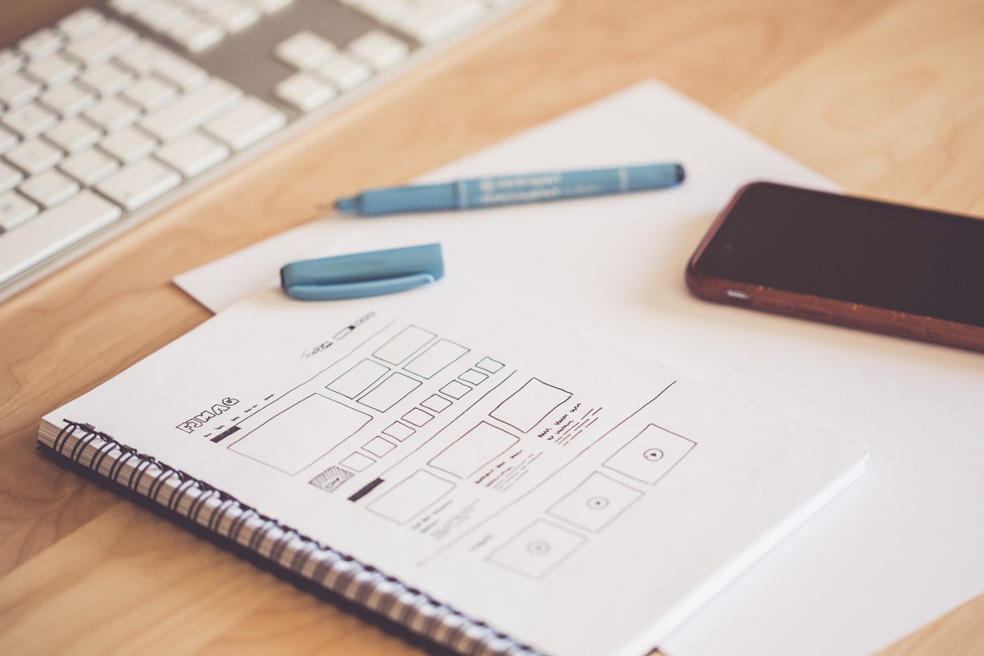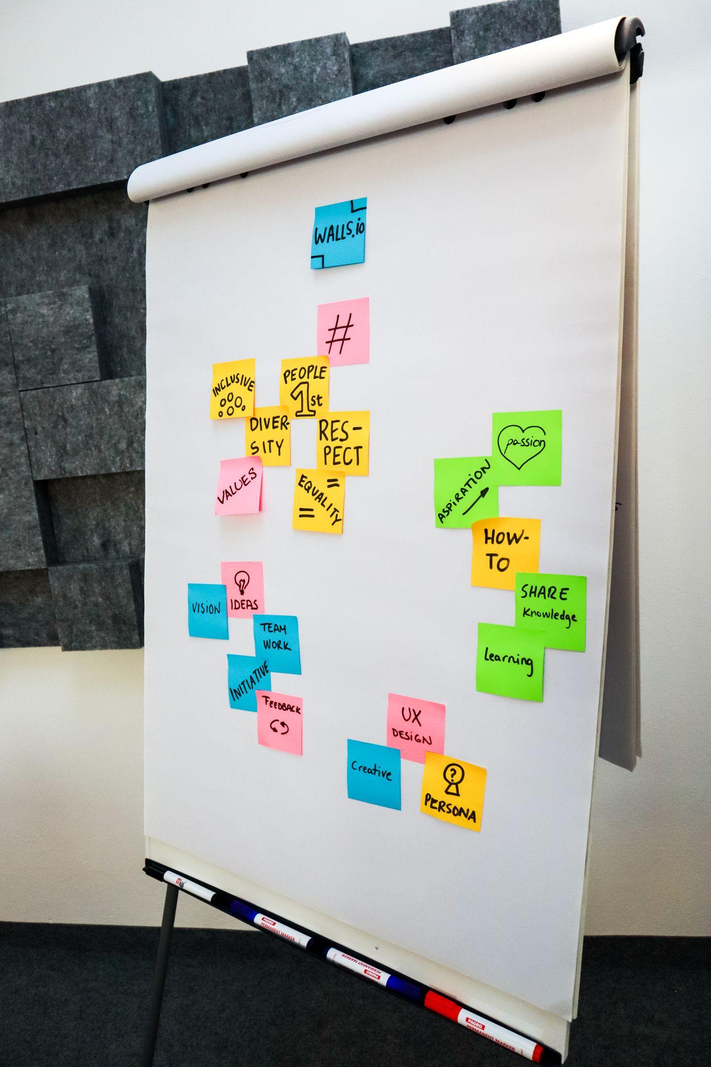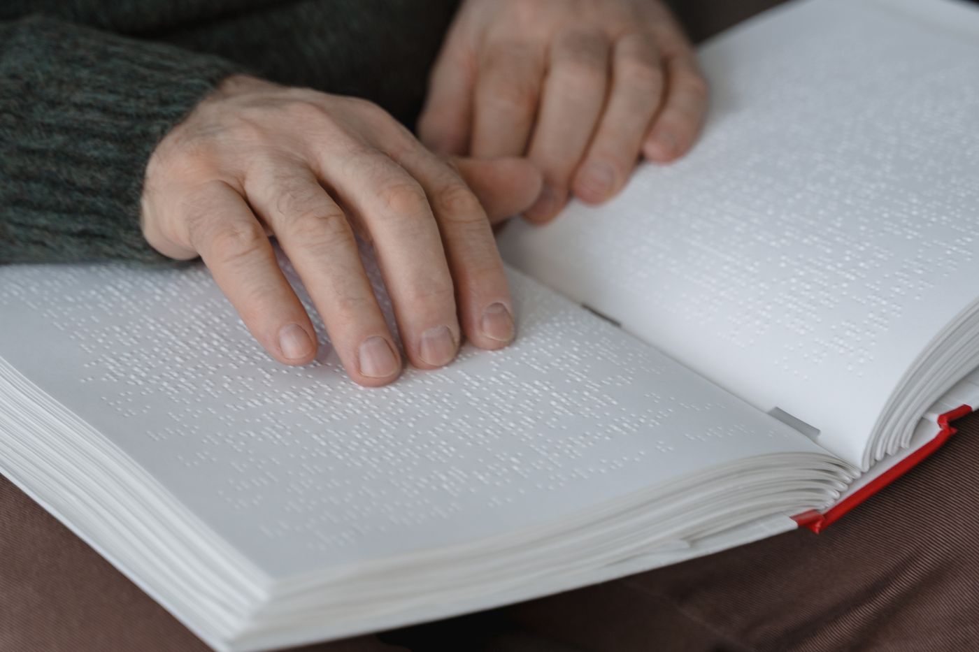
Studios love to treat accessibility as a checklist item — something to bolt on before launch, somewhere between favicons and cookie banners. We used to do exactly that, until a blind reader wrote to say our award-nominated site was, in her words, "a beautiful locked door." She was right, and the rebuild that followed taught us the central truth: accessibility is usability, measured honestly.
Every accessibility practice improves the experience for everyone. Captions help commuters on mute. High contrast helps anyone reading in sunlight. Clear focus states help power users who never touch a mouse. The curb-cut effect is real on the web: design for the edges and the middle gets better for free.
The four fixes that matter most
Contrast first. If your body text does not pass at least 4.5:1 against its background, nothing else you do matters — most readers are skimming on dimmed screens in bright rooms. Labels that say what things do. "Submit" beats "Click here"; "Search stories" beats a lonely magnifier. Vague controls force every user to guess, and guessing is the opposite of usable.
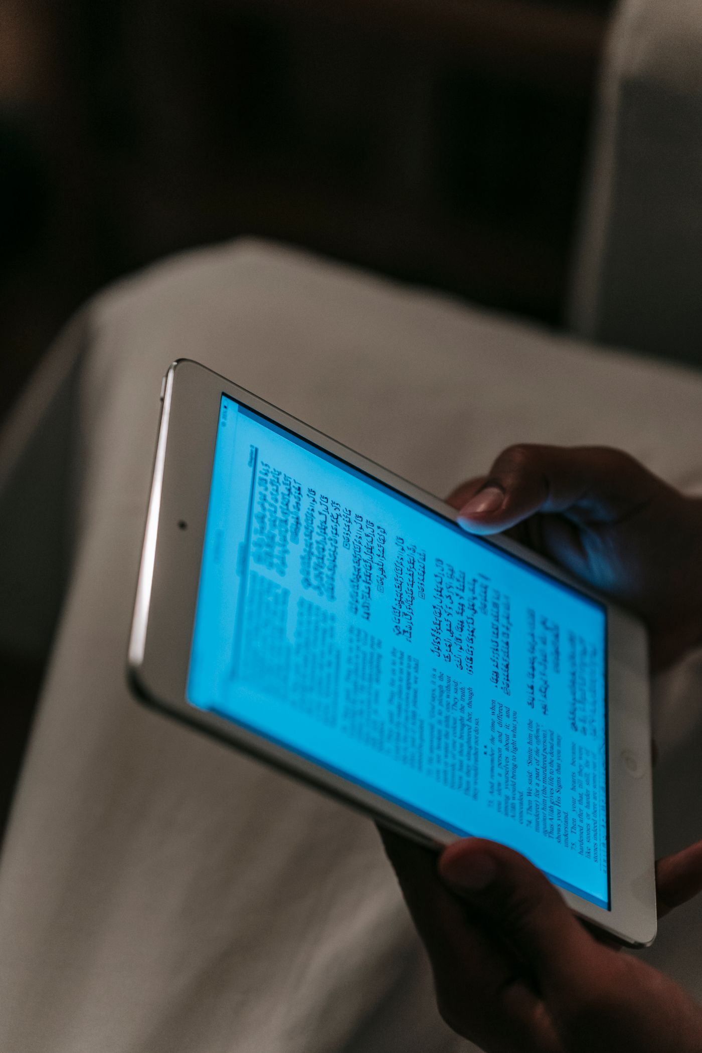
Keyboard paths for everything. Tab through your own site once a month with the mouse unplugged. You will find traps in minutes — menus that swallow focus, modals with no escape, carousels that never stop talking. Motion with an off switch. Parallax and autoplay are fine as garnish; honour reduced-motion settings and never let decoration outrank comprehension.
Make it a habit, not a phase
We folded three checks into every definition of done: a contrast pass, a keyboard walkthrough, and a screen-reader skim of each new template. Fifteen minutes per feature, and accessibility stopped being a project with a deadline — it became the way the work is done.
Start this week: unplug your mouse and try to complete one core task on your own site. Whatever stops you is stopping thousands of visitors. Fix that first, then fix the next thing. The door opens one hinge at a time.