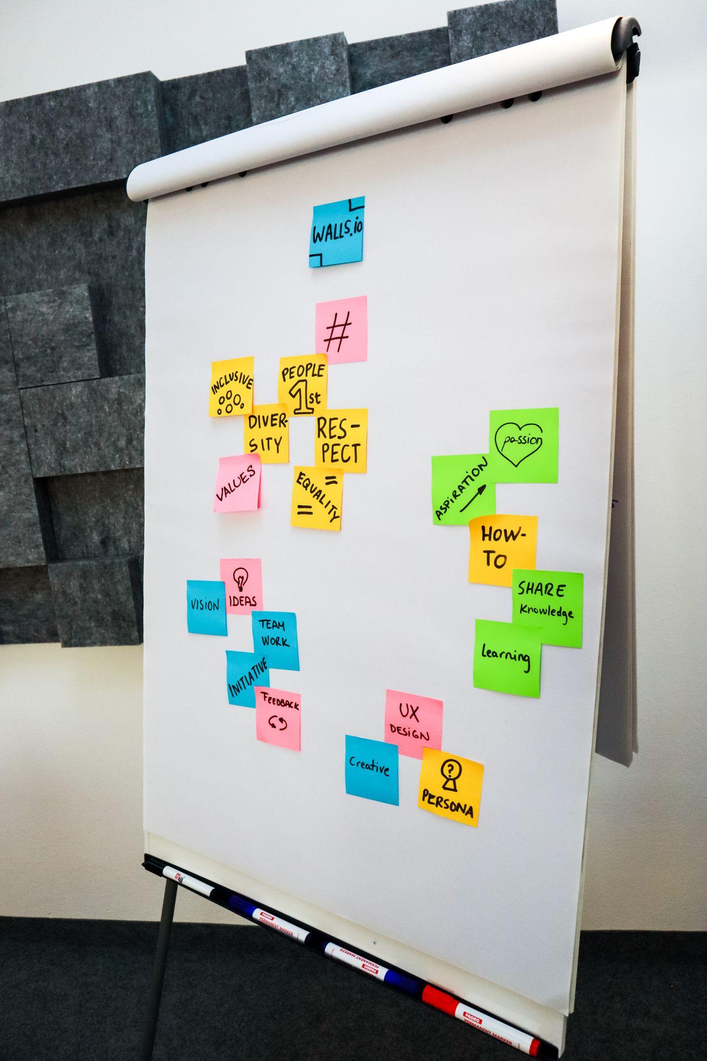
Every project arrives with a storm of opinions — stakeholders, trends, competitors, that one animation everyone saw on award sites. Our job is to hold five quiet principles against the storm and let them decide. They have never failed us, and they fit on an index card taped to every monitor in the studio.
1. Clarity before cleverness
A visitor should understand what a page offers within five seconds. That means one primary message, one primary action, and headlines written for humans, not portfolios. Cleverness is a garnish; if the underlying meal is confusing, no amount of garnish saves it.
2. Restraint as a feature
Every element must defend its place. We cut a third of most drafts — third paragraphs, fourth colours, second fonts — and the page always gets better. Restraint is what makes the remaining details feel intentional instead of accidental.

3. Speed is respect
A fast page tells the visitor their time matters. We budget every build — under a second to first meaning on modest phones — and treat each added script like a guest who must introduce themselves at the door. Performance is not engineering trivia; it is hospitality.
4. Warmth in the details
Honest does not mean cold. A well-written empty state, an error message that apologises like a person, a footer with a real address — these small warmths compound into trust. Users forgive mistakes from sites that clearly care.
5. Proof over promises
Testimonials with full names, case studies with real constraints, pricing without asterisks. The web rewards the specific. Whenever a draft leans on adjectives — "seamless," "cutting-edge," "world-class" — we replace one with a fact and delete the other two.
Pin these five to your own monitor. Argue with them, adapt them, but never ship without consulting them first. They are the closest thing our studio has to a religion, and unlike most religions, they fit on an index card.